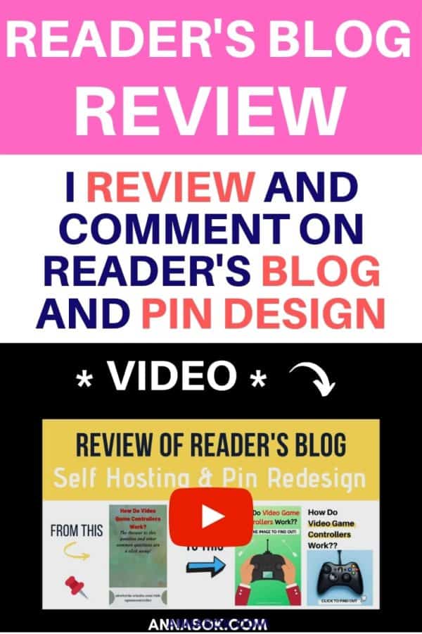
Reviewing a blog and reworking somebody else’s Pinterest pin design is a new thing for me…
A week ago, one of AnnaSok’s readers sent an email asking for feedback. I had a lot to say, so I figured it will be better done in a video format, rather than writing.
So I decided to help Amber out and talk to her about self-hosting vs free blog hosting; as well as redesigned one of her pins to show how she can get more traffic from Pinterest! She has done an amazing work writing those articles and trying to get traffic, but I decided to critique it – to help her move forward to her dreams faster.
She then allowed me to share it with you guys because we get it. Some of you may be in the same spot as her. And as much as I would love to record a video for every one of you who reaches out, there is only so much time in a day.
She also said,
“…I wasn’t offended at all. If I cannot handle constructive criticism, then I should’ve not ask. You didn’t upset me. You gave me hope…”
It’s a very chill video with noises and no editing.
If you like it raw – enjoy!
Links I Mentioned In The Video:
- Bluehost -> my fav website hosting provider
- Start a Blog The Right Way -> my video course
- Canva -> software I use to create Pinterest Pins
Related Free Resources:
- How to Start a Blog in 10 Days – free email course.
- How to Get Blog Traffic With Pinterest – free downloadable eGuide
- 10 Free Canva Templates – if you are having trouble with Pin design
- 36 Free Tools and Resources for Bloggers – article
Enjoyed the video? Pin it to your “Blogging Tips” Pinterest Board!
Self Hosting VS Free Website (00:00 – 03:05)
***everything below is a transcription of the video***
Hi Amber, thank you so much for sending me your email. And since you did send quite an interesting email I decided to create a video for you where I talk a little bit about your blog and Pinterest. Overall, I thought that maybe it would be more helpful this way.
First of all, yes Bluehost is prepaid yearly, but it’s such a good deal! I think that it’s totally worth it.
And I do understand if you don’t really have the money to afford it right now at this moment, but it is a very good deal when you pay yearly versus monthly for some other services.
Because, for example, Wix I think its like $20 per month. And this one turns out to be like $3.50/m or something like that when you pay yearly. So at the end of the day, it’s totally worth it.
I got mine for three years, but now looking back. I wish I got in it for five years because it would have been even a better deal. But yeah, that’s my little rant.
On the other hand, you also said that your plan was to make enough from affiliate marketing monthly to upgrade to a domain and a yearly plan and invest more as you got more income. And you’re asking me if it’s too unrealistic.
So the thing is, this is not unrealistic at all. But the only thing is that by the time you make this affiliate monthly income, you will have already built a little bit of authority on the free domain.
And I’m only scared that, first of all, it will take a little bit more time. But secondly, you don’t want to just redo your whole blog after it’s already starting to make money. Then it will all be lost! And with a free platform you can’t put ads on it.
Bluehost is one of the cheapest services and I found it to be amazing! I use it for all of my blogs, and you can put ads on so that’s extra income.
While it might seem like a big investment if you can invest a hundred bucks and get Bluehost for a year and get a domain name then whatever you are building it will be yours at the end of the day. And you will be in complete control over how you use it.
So if you want to put ads, if you want to put affiliate links, if you want to sell your own courses, it’s all going to be up to you and you have full control. While as with the free one not really.
So I understand it’s a bit of an investment, hundred bucks, but honestly just don’t drink coffee for half a year and invest that money instead into your business because it will pay off. And you will have enough money to justify the expenses if you just keep going at it.
Blog and Article Review (03:06-09:54)
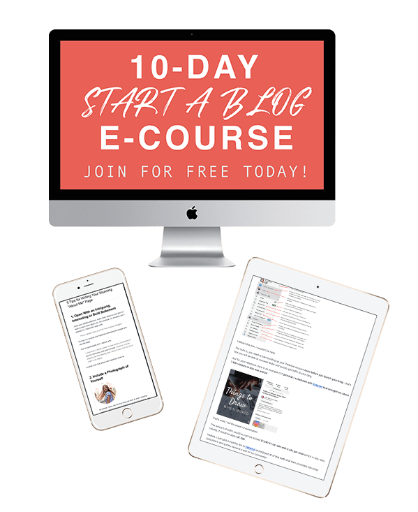
Join the Free “Start a Blog” email course I created for you!
In it you will learn how to choose a blogging niche and a name, when you can expect to make money, how much it costs to run a blog/month, how to get free traffic and so much more!
The first thing I see on your homepage is that it’s not a professional website.
And the only reason why I see it – is this part that says, “…was designed with wix.com website builder … create a website today … start now”. This just looks unprofessional and I think to myself, “Why would I trust what you are saying to me? If you don’t have enough control over the website, is this a fake website? Is this a new website? Are you just starting out?”.
Those are the kinds of thoughts I have, so why would I trust you with my purchase if I can go to other websites that look way more professional. So if we were just to take that away it would have been way better.
Even when I scroll it just kind of follows me around which is really annoying as well and I just can’t forget that this website is not very professional or it’s not a website that’s been around for a long time. So those are my initial thoughts. But if we take this away, everything else looks great.
We have a nice little menu on the top. And what I also noticed is that we don’t have a logo so I don’t know what kind of website it is an AKWBorden. I don’t think it’s a good name and I mean, it doesn’t tell me anything.
Maybe it’s some kind of name for video game thing. But for me, it doesn’t tell me anything and I would like to see a name right here so I know who I’m reading from.
Otherwise, everything looks great. This looks fantastic. I really like how you change these. So you have these three things like your reviews topless and education. And then you have your new articles. So all this looks fantastic.
The only thing is I see that only three people watched this if you can take it away, please do because if I didn’t see this 3 I could have assumed maybe 500 people saw it maybe 10,000 people saw it. I wouldn’t know so I wouldn’t care but because I see only three people saw it, I’m like, “…so should I trust this? Only three people saw it”.
I see that you have a lot of Articles which is incredible. That’s really really good. And then I opened this random article,”How to store video game controllers”.
It’s pretty cool and when I’m looking at it. I’m like, okay, how do I store video game controller? So you talked about it a little bit. I’m not sure what this is all about. I referral link affiliate links sure, but do you have it in every post? It’s kind of a lot!
In my course start a blog the right way, I talk about how to make this not so prominent because it seems like such an important piece of information which I don’t think it should be right here. Then we have “displaying your controllers” and it kind of confuses me because we’re talking about storing and now you’re talking about displaying.
So are they part of the same thing or no? I can see this is your pin and I think you definitely should work a little bit more on your design for the pin because it doesn’t really catch my attention. If you know what I mean, and then the rest looks good. I like that you are separating them by categories and looks great and you have some source and I guess this is where I share and then we have recent posts and mission statements.
So the rest looks pretty good. I would just change, I mean not change but like start improving the design of your pins. Think about if I saw this between like 10 other pins, would I click on this one? Probably not because the colors are not vibrant, the text is pretty small and I’m not sure what this is all about. So, I would think a little bit more about the design.
And you said that you will not rank on Google because it’s a free site and that is not true. You can still rank on Google even though it’s a free site, but will this content rank on Google? I don’t know. I feel like maybe this content is a little bit too small.
Let’s see. I’m just going to select. all of this information without the source and open it in a word counter. I’d like to see how big this content is… 726 words. It’s kind of a small piece of content for something like a response post “how to store video game controllers” where you just respond.
I would suggest a minimum of 1,200. Plus I also selected this part, but it means absolutely nothing to Google. It talks to nothing about video game controllers and it’s like a prominent big piece of information. So Google will not really understand that. Let’s see if people are searching for how to store video.
Well, I already searched for it, but. People do search for it for sure. And then here’s the thing when I see this kind of result right away. I can tell that you can rank number one here. If you just have a good strong piece of content right now you’re competing against Pinterest. So that’s pretty good, because you can still overthrow them you’re competing against something else like a forum.
If you see things like that. It means you can be ranking number one there. We have to read it. But let’s see. What do we have here? Okay this content, for example, see how to store them. I guess these are just like the one to eight choices, so this is would be like a highly shareable piece of content, right?
I would just write an incredible piece of content that talks about everything and that has some images and just way longer than this and then I think you would start getting that traffic from Google and if you want to get that traffic from Pinterest you obviously have to make sure that your pins are better.
Pinterest Profile and Pins Review (09:55-13:56)
So let’s go to your Pinterest and see what do you have here? You have some featured boards, accessories that I don’t know what they have to do with video games, stickers. Okay. Maybe you can stick on controllers and stuff. Okay, girl gamer, girl apparel, game Girl accessories.
I can see you have a very little amount of pins. You should have at least 25 pins in each board. I can see your activity. I can’t see your boards. Where would I click to see your boards? I have no idea is this a business account? Here’s see all boards. If it’s not a business account, you should make it a business account. And I can see you have some group boards.
Okay. So here we have your board. Yeah, I would move it up for sure and make it featured because this is your board. This is how you will begin bringing traffic, this is the most important board in your entire Pinterest.
Okay. Some of them are just products. That’s okay. That’s totally fine. I do that as well. But how can you expect to get Pinterest traffic? If you only have like one two, three, four, five six seven pins that don’t even look amazing. I’m sorry, but they really don’t so. How can you expect to do to get good traffic if they are just dull, you know what I mean?
And I’m sorry if I sound a little bitter or something. I’m really trying to be helpful here and get you to actually make progress. So these are like I guess quotes. And stuff, so all I see is a few pins that are leading to your articles, but you do have quite a few articles. Where are all the other pins?
You should at least create two to three pins for each single article for them to rank. Okay, let’s open this one pros and cons and let’s see what’s up. Okay, interested in learning about the pros and cons, Vision with faith for general information purposes only. This is America.
Why is this here? Why is your disclaimer here? It shouldn’t be here. You should always change it so that people who are looking for this content can find it. I understand. It’s automatically inserted based on your sharing program, but that’s the thing with WordPress that you can have other plugins and you can control this information.
So people can find your pins easier. I lost it. I lost it see. Yeah, you send me some other links so I couldn’t open it, but I found it from your Pinterest.
Okay, let’s talk a little bit more about this because I want you to be successful. I want you to get traffic. I want to be happy with the traffic you’re getting I want you to be able to make that affiliate commission and to get that hosting.
The only thing is that right now you’re writing on this free website and everything your building is something that’s not going to last because then you will get a domain name. Then you will start paying for hosting maybe you will change the Bluehost and everything You’ve done will be lost. So the sooner you get this together the better and if I could I would just even borrow a hundred bucks from someone to get it started because if you are serious about this if you want to make money with this, you have to start building it from the beginning.
Pinterest Pin #1 Review and Redesign (13:57-23:30)
Okay, let’s talk about this pin, “How to video game controllers work. The answer to this question and other common questions are a click away”. Sure, that’s kind of interesting. We have the, “answer to this question… just click” so you have a call to action. That’s fine. That’s really good actually, but it’s all dull.
How about I do this, I’m going to download this image. Now I would like to go to Canva. And I’m going to redesign it.
Let’s do just Pinterest. I’m not going to be using any templates. I’m just going to be coming off of what you were talking about. And I think it would be really helpful. For you and for everyone else who will be watching this. Yes, I’m going to upload this.
And I’m going to create a design. Based on the one you did. Okay, so I’m going to have this one here. I always have a lot of tabs open Don’t Judge Me on that, I know it’s pretty terrible. But so I have this open. I’m just going to have it open on a different screen. Okay, first things first you have this like ugly green.
Then you have this crazy red and black and then we have your website. That doesn’t tell me anything because it’s a free domain. So, excuse me. You want to stick with green? No problem. Let’s do green. Let’s do green so we’d have maybe patterns may be a gradient. Like I don’t know if you wanted something green here.
It is sure. We have a question, “how do video game controllers work?”. You have one second to interest somebody in clicking on your PIN. So what do we need? We need a video game controller. Let’s see.
There you go. Something like this, most likely. Sure, let’s do this one since you wanted green. Let’s put this one in. Sure, let’s make it more centered and you have this question “how do video game controllers work?”. So let’s add a heading, “how do video game controllers work?” Let’s make it 165p.
And let’s change the font because this is hard to read. Find me something easier to read. Sure. Something funky because I can see you do like a bit more funky stuff?
Two question marks to get this here and you wanted to make it red. No problem. Let’s make it red now when I make it red. So not the craziest red but sure let’s make it more red. This does not look good. I think it looks better. Just open this here.
Right. So if we’re looking at this versus this I didn’t even have all the information but it already looks better just because the colors are brighter. So somebody would be more likely to click on it. And then you also said the answer to this question and other common questions are a click away. “The other common questions part” I don’t know, but the “answer to this question is one click away”, Sure cool. Let’s do that.
But because we have a very limited amount of time to introduce the person and get them to click, we can do, “click to find out”. “Click the image to find out”, there you go, and we can make it like this and add black. You can use the same font. Making it bigger.
And what do you want them to do when they see this image? You want them to click on the image? So this has to be the most important part of the entire thing. Let’s add a color since on the bottom of your original image, you had this white. Let’s stick with the white.
And you put it right here. Right. Maybe I can make this bold. Maybe I can find an arrow. Right. So something like that. You can even go crazier you can, well, make this here. See if that’s going to look pretty or no.
Just so it stands out. Maybe maybe not. I don’t know. I’m not sure about that one. Maybe we can change that just this color. Not loving this. about this way.
There you go, “how do video game controllers work, click the image to find out more”. The image here and then on here, you can have your website’s name because even if you have the entire URL chances of somebody going in and typing your url are slim to none like seriously. So the problem with this is that we have wix site.com it just doesn’t look professional.
It doesn’t look good. I don’t know. So that’s that. But if you really want to have your website on this white sure have it here just make sure it looks pretty nice, but it doesn’t really take away from everything else. Actually, I would just if you really want it white, I would just keep this white because it’s a nice green.
It’s gonna show nicely. And this Arrow I’m not in love with it’s hard to see so. Sure. Let’s try this one flip. I don’t really want to spend a lot of time on this but you can. See that I’m not afraid to make changes and get rid of things and make it not perfect. But just still make it stand out. And while this image is a bit better than this one. But you have like people are going to be more likely to click it.
Pinterest Pin Version #2 Redesign (23:31-34:36)
You can go even further than this and how I would do it is I would actually search for a photo like a “game controller”. Okay, and then I would see which ones I like. I like this one for example, so maybe not a black background. There you go. So we have this. And we have this title how to video game controllers work. And so at this, we want the main stuff to stand out always.
So no matter what – main stuff has to be most important. I don’t like this red. Yeah, I don’t like this either it didn’t work. So it’s fine. It’s not good. You can’t tell what’s going on. I hate this. Okay? No, this is not working. Okay, let’s try something else. Try moving it up. I don’t like it. You know what I’m going to do when I don’t like it – I delete it. Because it’s fine. It doesn’t have to be perfect. I can just take it again the same image if I really wanted to. Place it right here. There you go.
But the most important thing is this text. Let’s not make it green anymore. So ugly? I don’t like the text anymore. Yeah, I never do fonts in this, people will not be able to even understand what’s going on here. So let’s do it. Okay here we have this title video game controllers work. So I liked it but kind of boring. So what if we took this? And just kind of, let’s see if this one looks good.
I like working from far away so I can see what’s going on. That makes sense. I want to see the big pictures because what I’m looking from up close sure it can look very pretty from up close, but then I look far away and looks very ugly. So I want to make sure I see everything. So how about we click this “how do video game controllers work?” and then I’m going to copy this. Okay. We’re going to “click to find out” and then I’m going to make it big. And we’re going to make it a way smaller size.
And the only problem right now is that I don’t like this part. So what if I make it down as well? Or what if I make it twice? But I want it to be like, “yes, I meant for it to be crooked. I meant for it to catch your attention. I didn’t just make a mistake”. Do you know I’m trying to say? so we can do another arrow again.
Then this time, you can do something funky a little bit maybe. Or maybe we can do a mouse click because you know, It’s about gaming and stuff. so. I’m not loving it though. How do we make it kind of cool? Okay. It’s kind of okay. Okay, I kind of have a love-hate relationship with this but it kind of looks okay. So maybe I can make this yellow. Ew, nope. Okay.
So then I would just download and share and as you can see the first image right now looks worse way worse than the second one. So the first image Looks Like “Maybe I would click” and maybe “not really” the second one.
Oh, man, I would totally click this. I think it looks great. And if you compare it to yours, I’m not. Okay. So here’s the thing. I want you to understand I’m not trying to tell you how shitty Your Design is because it’s not true. I’m trying to say is that when I started creating these designs, This is what my designs look like. So you’re not the only one and Pinterest is full of these designs, but now it’s time for you to understand some kind of principles and try to improve your work. So if it doesn’t stand out to me, I don’t want to see it and if it’s this size, do you think that really would catch my attention?
What is all this empty space? So try to see your work from far away? Make it more bright make it more noticeable. And if I look at it for one second, and I don’t want to read anything. I need to know what it’s all about or I need to be intrigued. I need to be curious and if you don’t even have a controller here, how do I know that it’s about controllers if I don’t want to read the text or I’m just quickly scrolling and this is absolutely unnecessary. It doesn’t help your design at all and. Well, you know, it’s a free domain and also we don’t need to know exactly that link that it’s at because nobody’s going to be typing it in. We’re just going to be clicking it.
So that’s kind of my five cents. I hope it was a little bit helpful for you and I hope you’re not hating me right now for all this honesty. I am trying to help because I wish somebody looked at my website two years ago and said, “hey, this sh*t. Here’s how you can improve it 10 times faster”. And maybe saved me months off feeling like nothing’s happening.
So I’m going to send you these two images you can use them. You’re free to use them. You’re free to post them. Make sure you have nice keyword research descriptions for the Pinterest and I hope that you at least learned something new today, and that from now on you’re going to be moving faster.
I enjoyed making this and if you don’t agree with me on some points, please do let me know and I hope I didn’t offend you in any way. All right, I’m gonna send them over to you and I’ll talk to you in a bit Amber, by.
